Visual Identity. Creative Direction. Website Design.
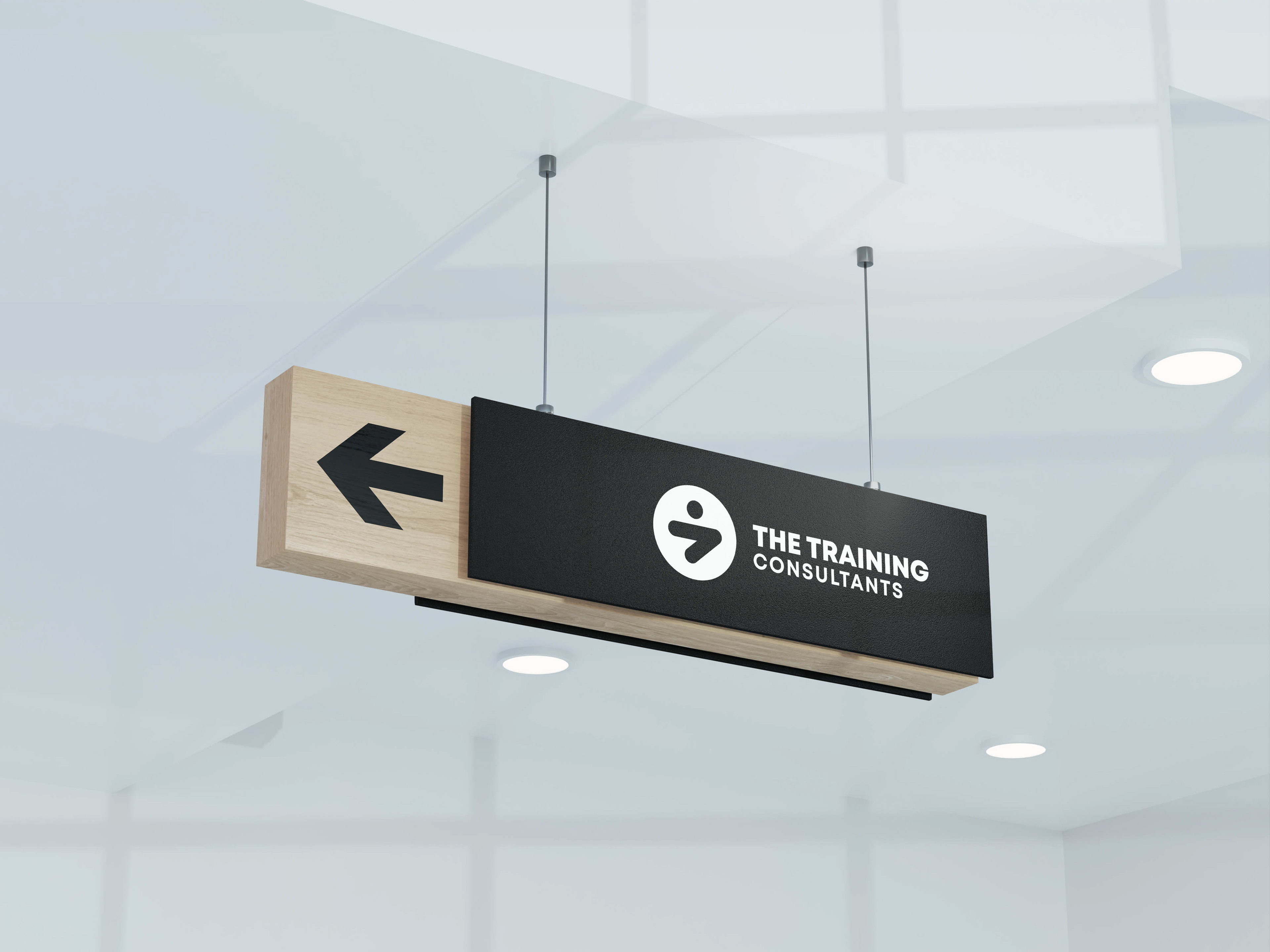
The identity for The Training Consultants needed to embody professionalism, efficiency, and a commitment to client progress. The chosen logo mark achieved this by blending meaningful symbolism with a clean, modern aesthetic, much like finding a clear path on a complicated map.

The Identity: Holistic Progress
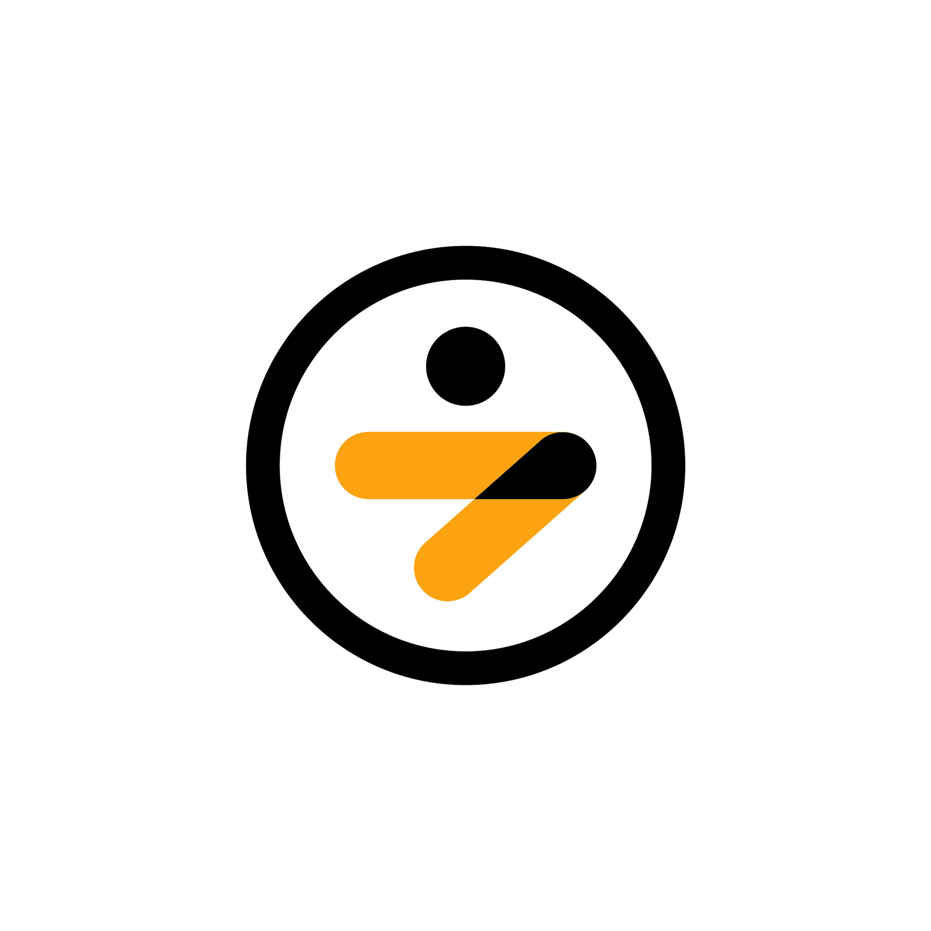
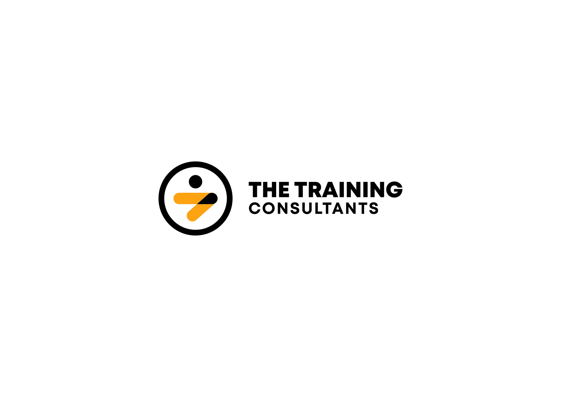
The successful logo mark features a stylized figure within a circle, formed by a forward arrow. The design communicates TTC's core values through three key symbolic layers:
The Circle (Unity):
This element symbolizes unity, wholeness, and infinity , suggesting a comprehensive and holistic approach to training and consultancy.
The Forward Arrow (Progress):
The prominent arrow, pointing ahead, represents progress and forward-thinking guidance , emphasizing the commitment to assisting clients in moving ahead. The use of vibrant golden tone adds energy and focus to this forward movement.
The Human Figure (Support):
The overall composition creates a human figure, signifying personal support and the company's focus on helping individuals and institutions navigate complex paths.
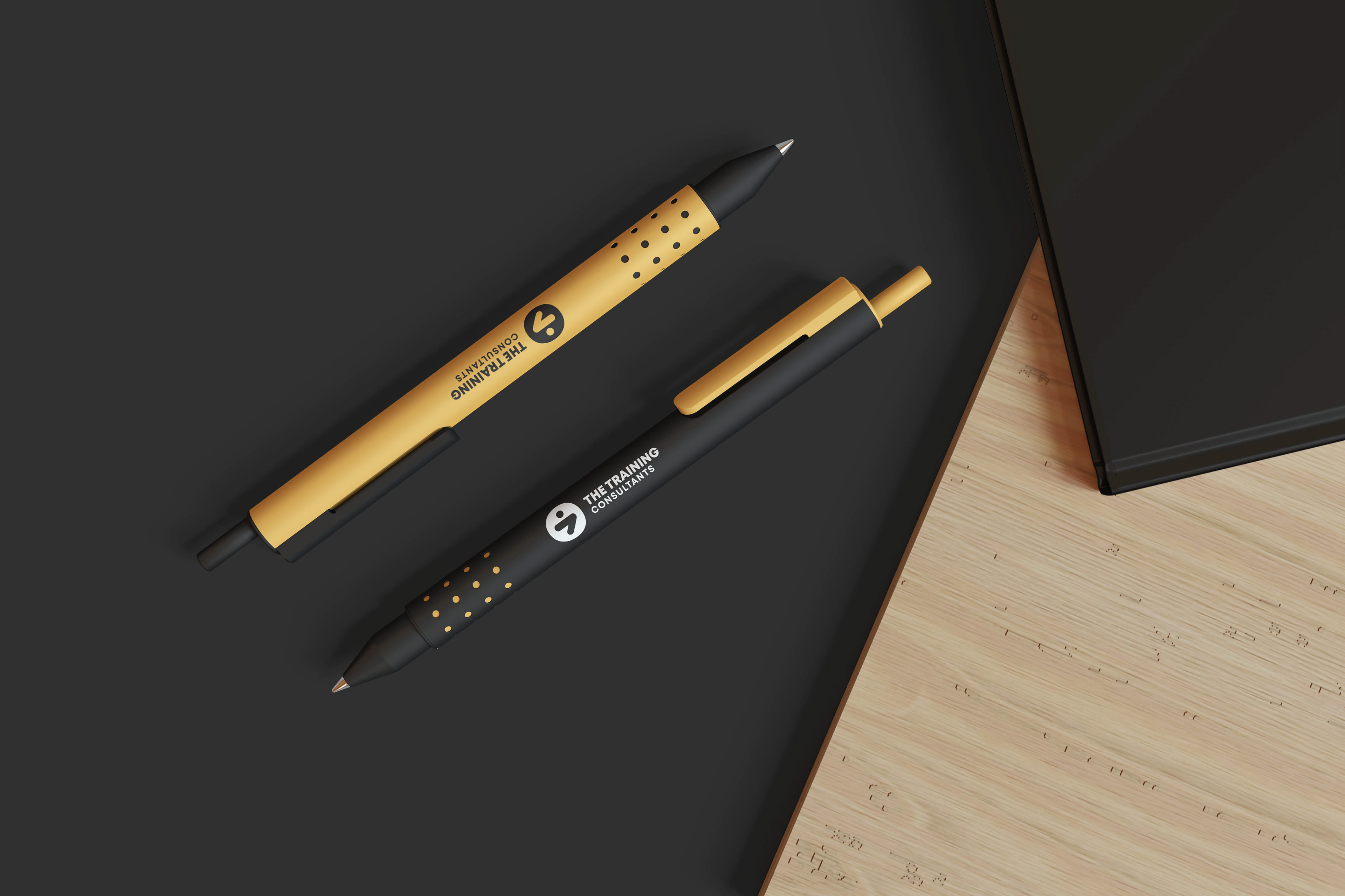
Simplicity with Meaning
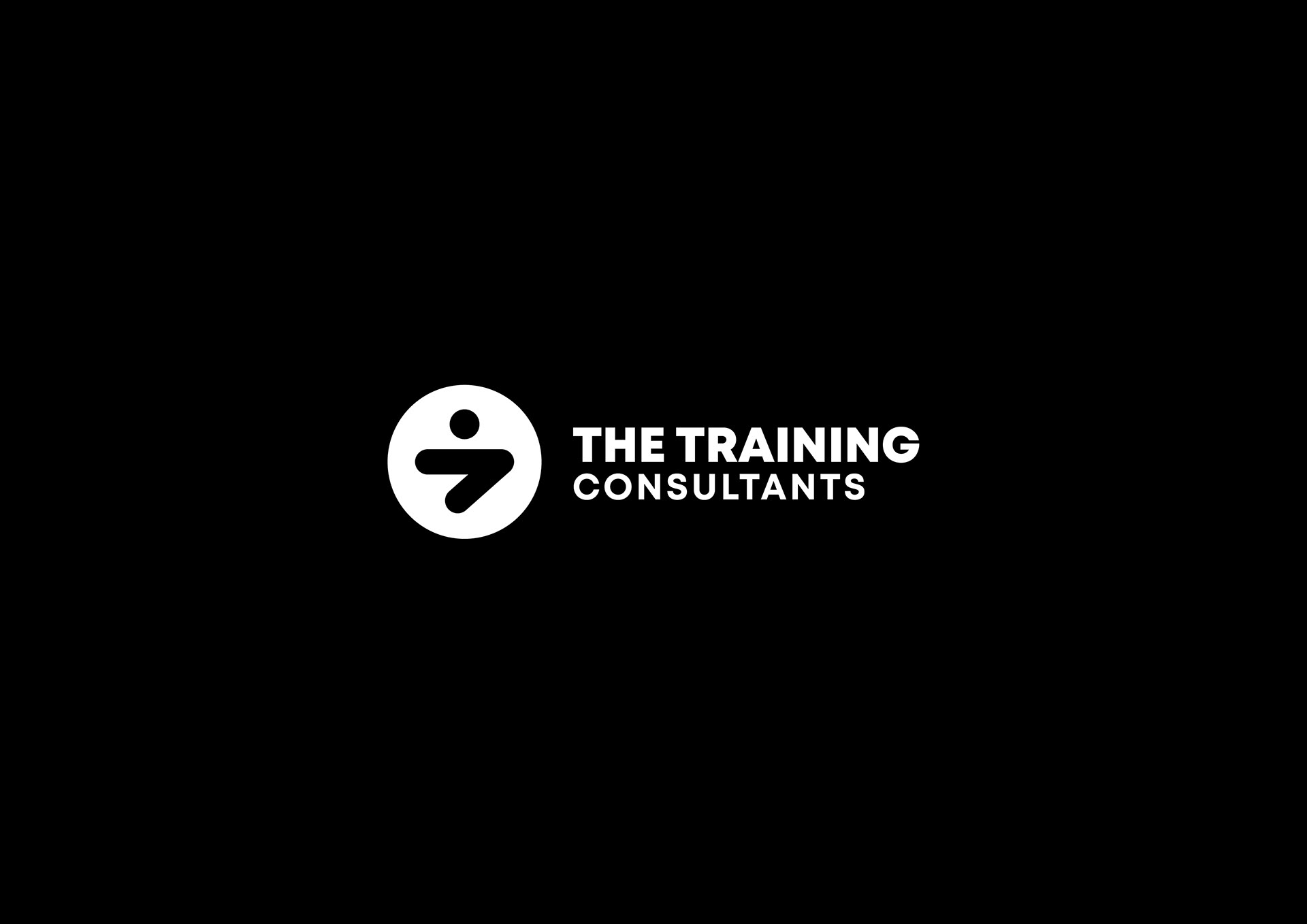
The overall design successfully combines simplicity with meaningful symbolism. It effectively communicates the company's values of professionalism, efficiency, and client support. It’s a mark built for trust, clean enough to be used on corporate documents and digital platforms, yet dynamic enough to represent real, tangible growth.
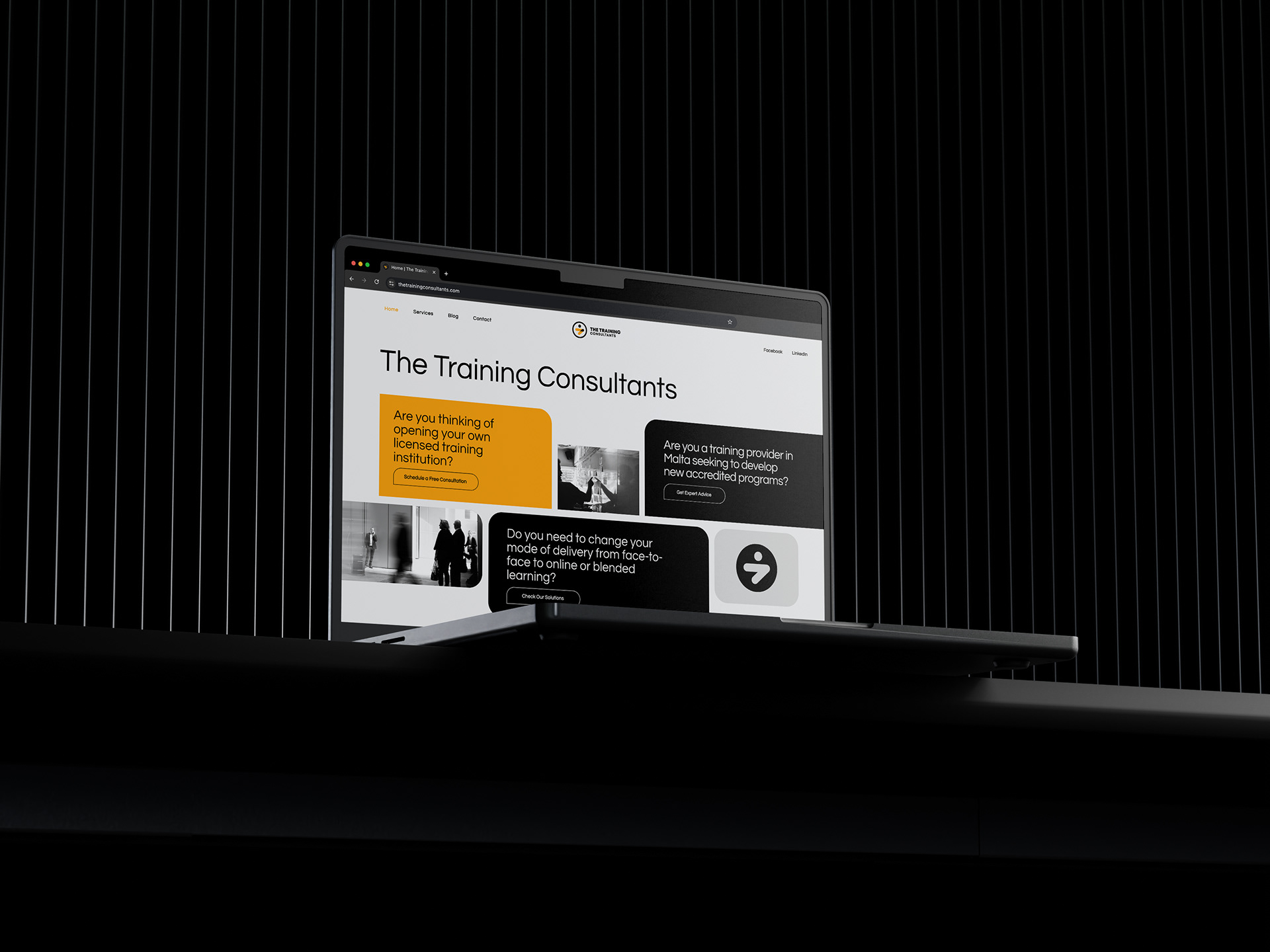
This project showcases the ability to distill a complex service offering into a single, compelling, and instantly understandable visual asset. A creative compass guiding clients toward their goals.