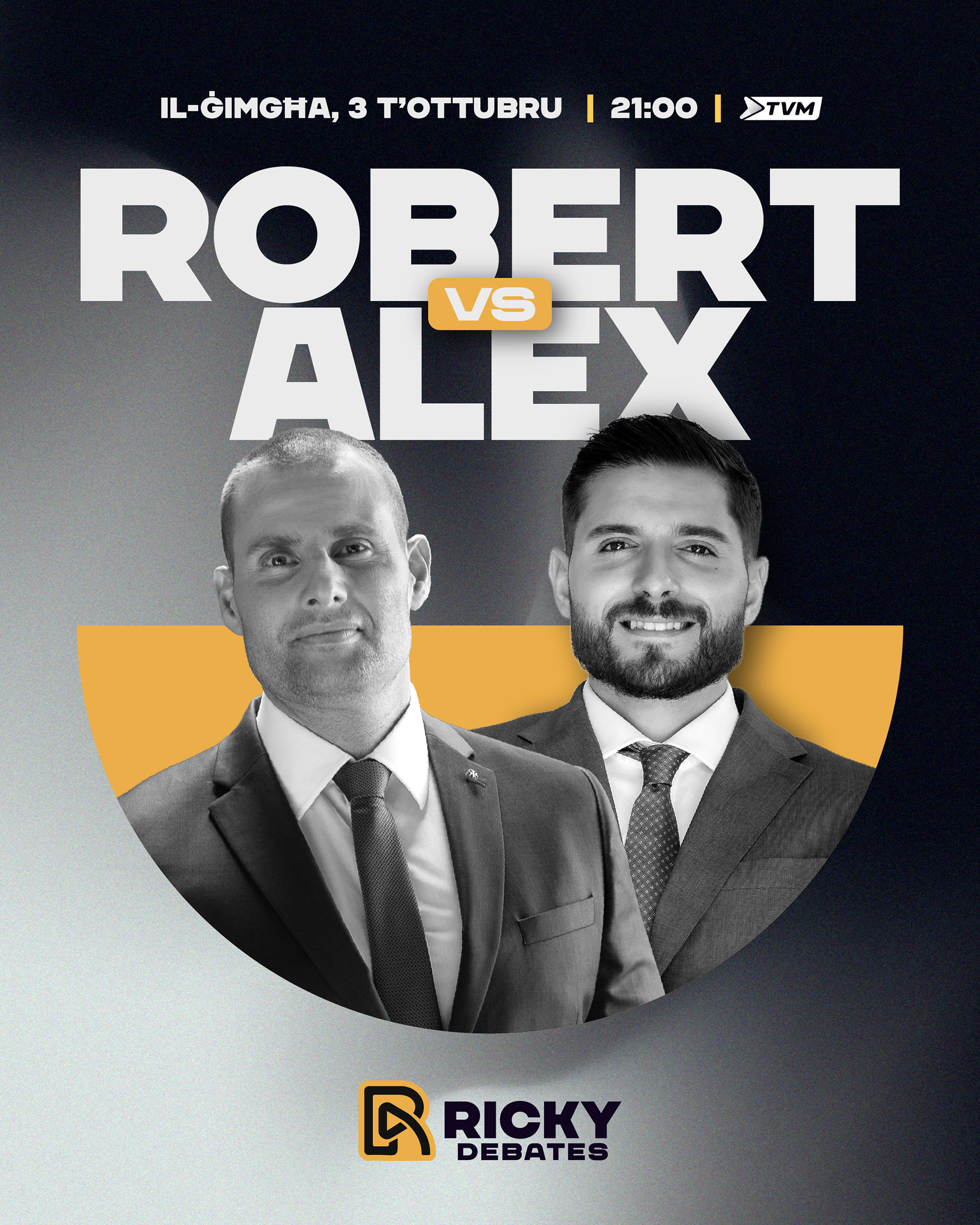
Visual Identity. Creative Direction.
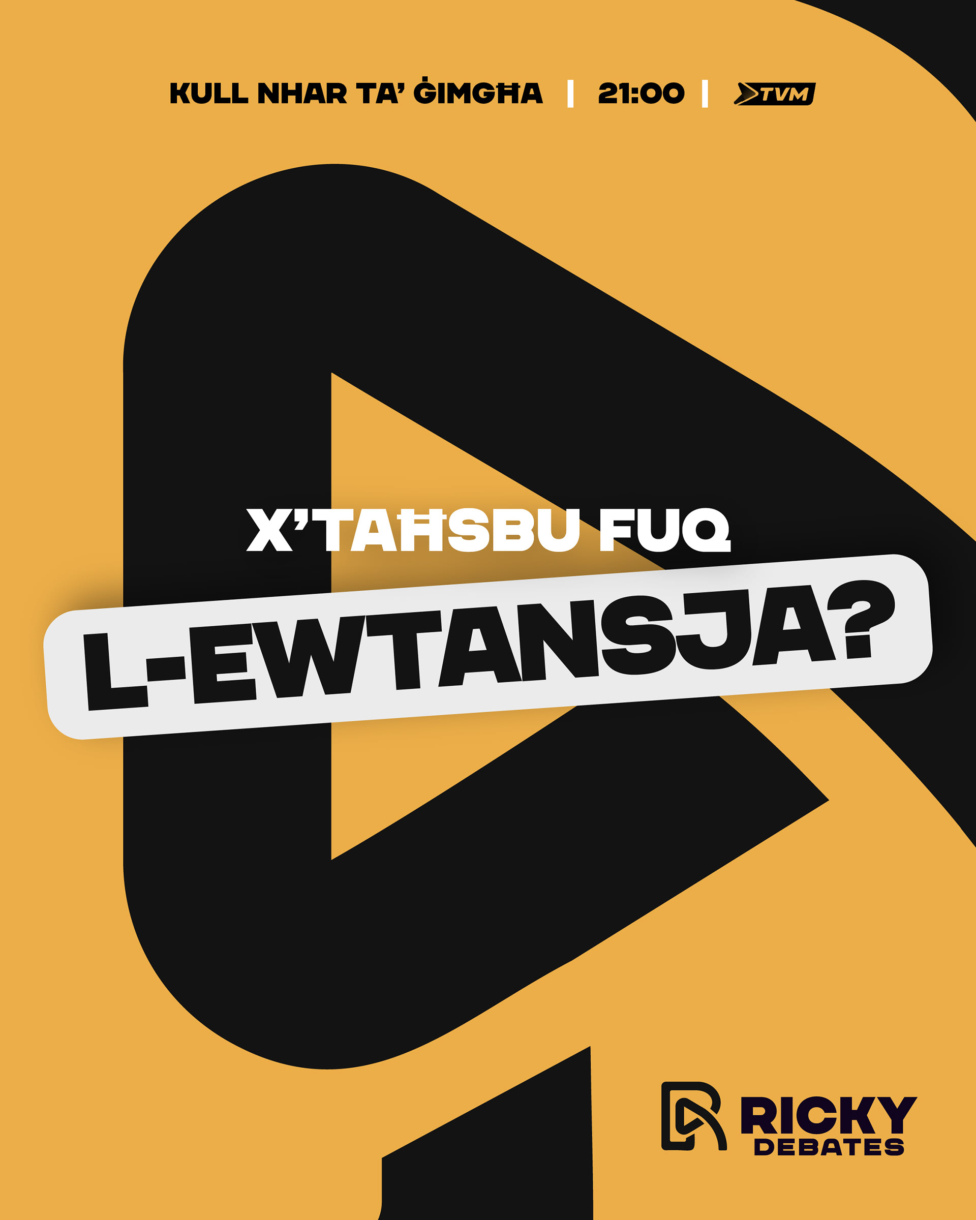
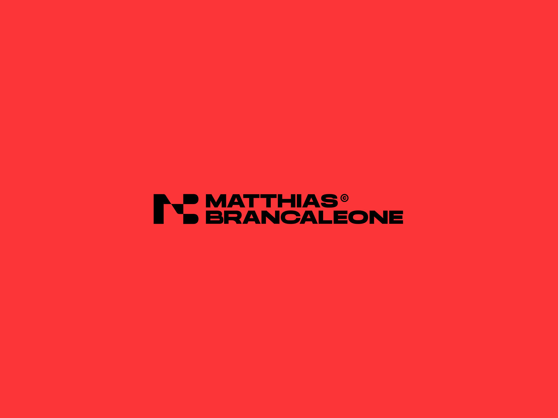
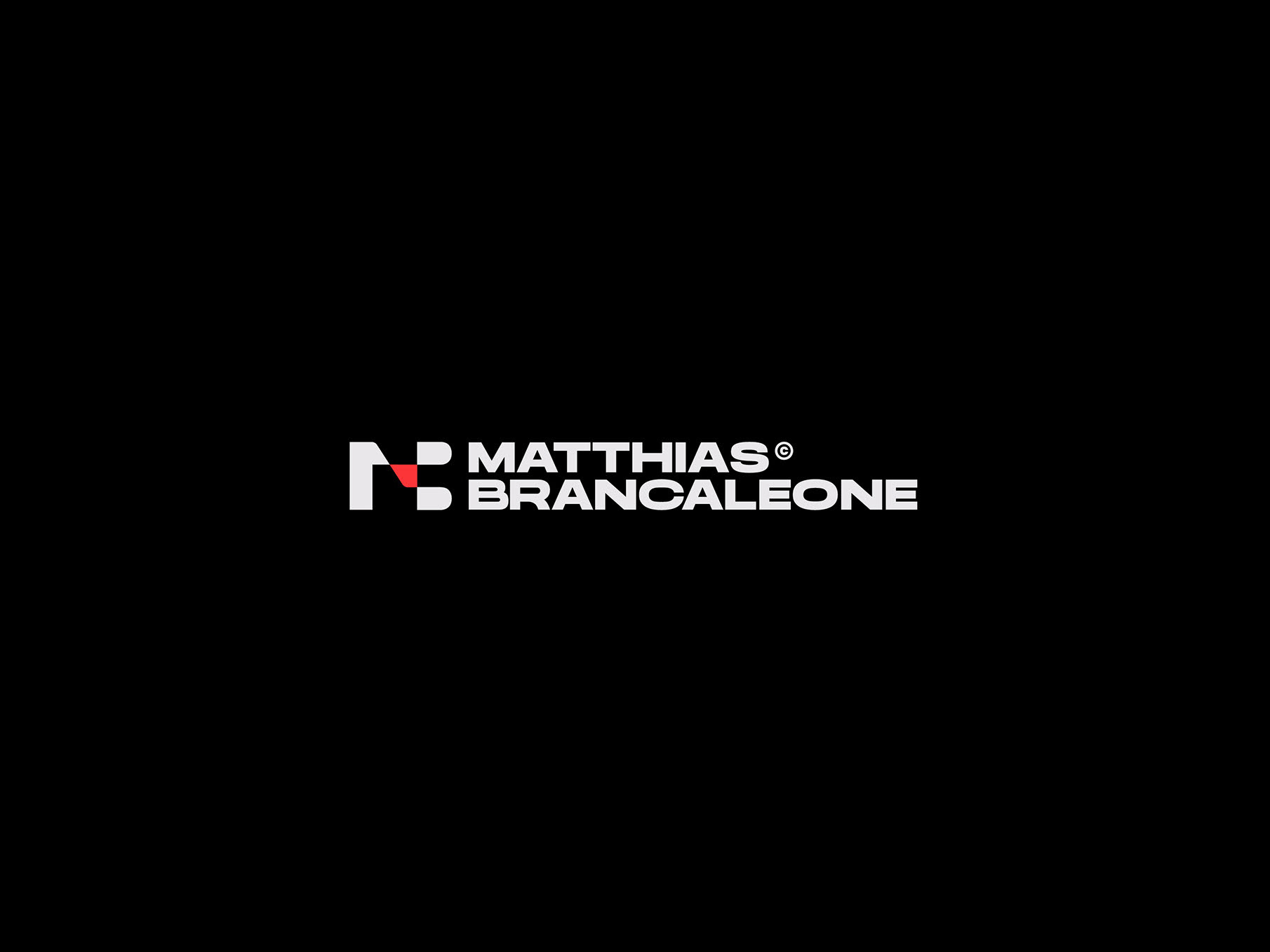
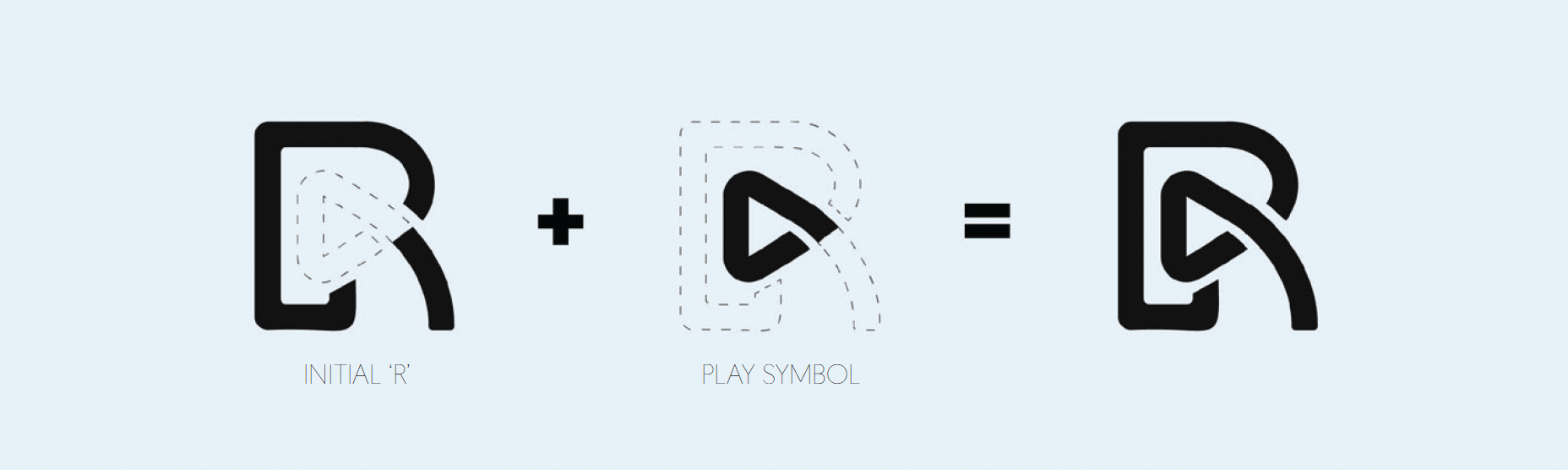
The challenge was to capture a multi-layered concept; a debate show, the host's initials, and the universal 'play' icon, into one highly legible mark. The initial request for the play button within a circle, while conceptually sound, posed a significant threat to scalability and clarity on broadcast screens. The solution was the Debate Playmark. A single, integrated icon that transforms the logo into a bold, recognizable symbol that works across every screen size.
The Identity: Modern, Media-Ready
This identity is all about maximum impact and flawless execution in the fast-paced world of broadcast and digital media:
The Smart Integration:
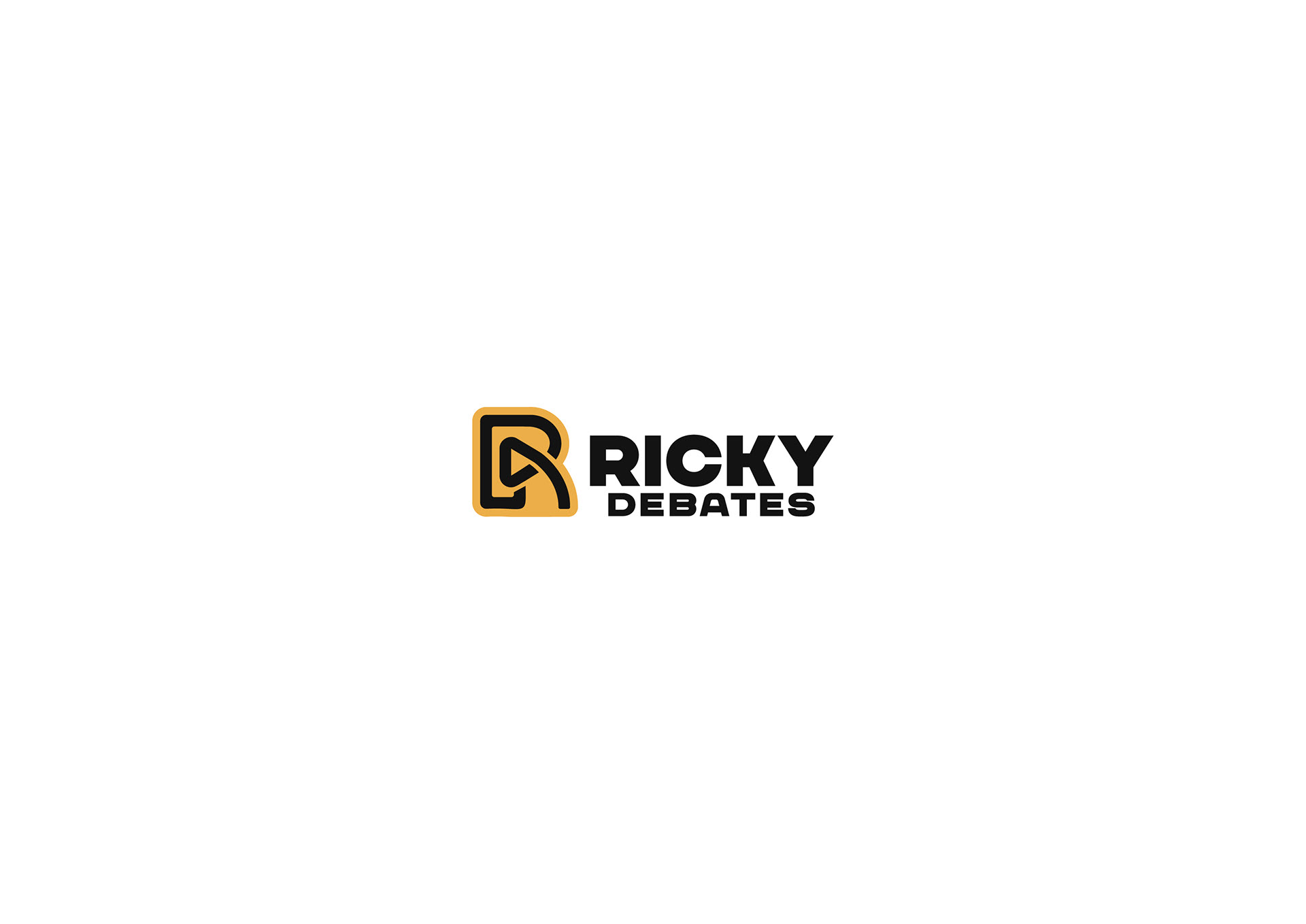
The mark cleverly combines Ricky's initials with the universal play symbol, creating a modern identity that is instantly tied to the show. The meaning is literal: the initials (R for Ricky, D for Debates) merged into a play symbol.
Built for Broadcast:
This design system prioritizes scalability. The icon stands alone, ensuring that even when shrunk to the size of a bug (fly on a TV corner), the R/D monogram with the play button remains legible and recognizable.
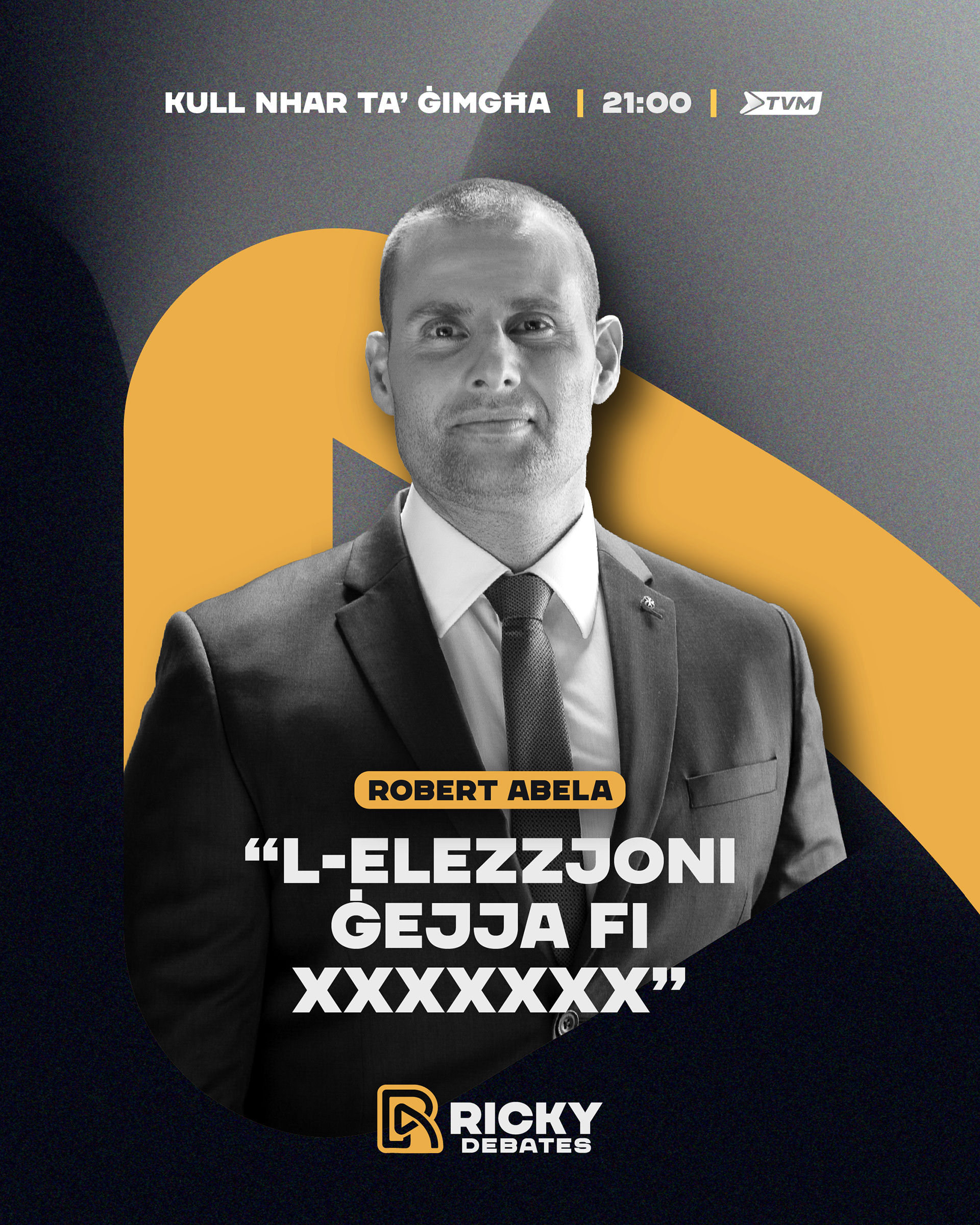
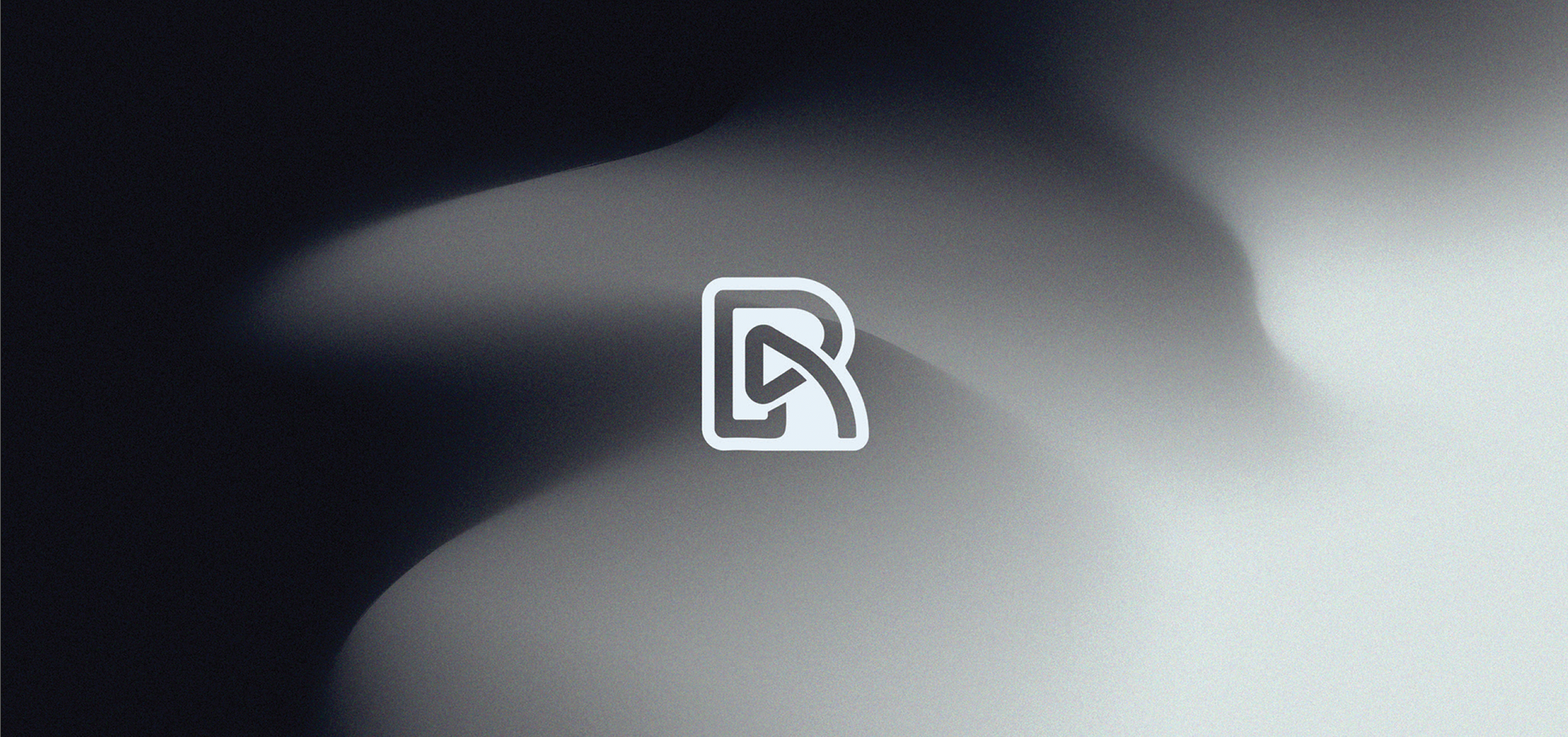
Creative Flexibility:
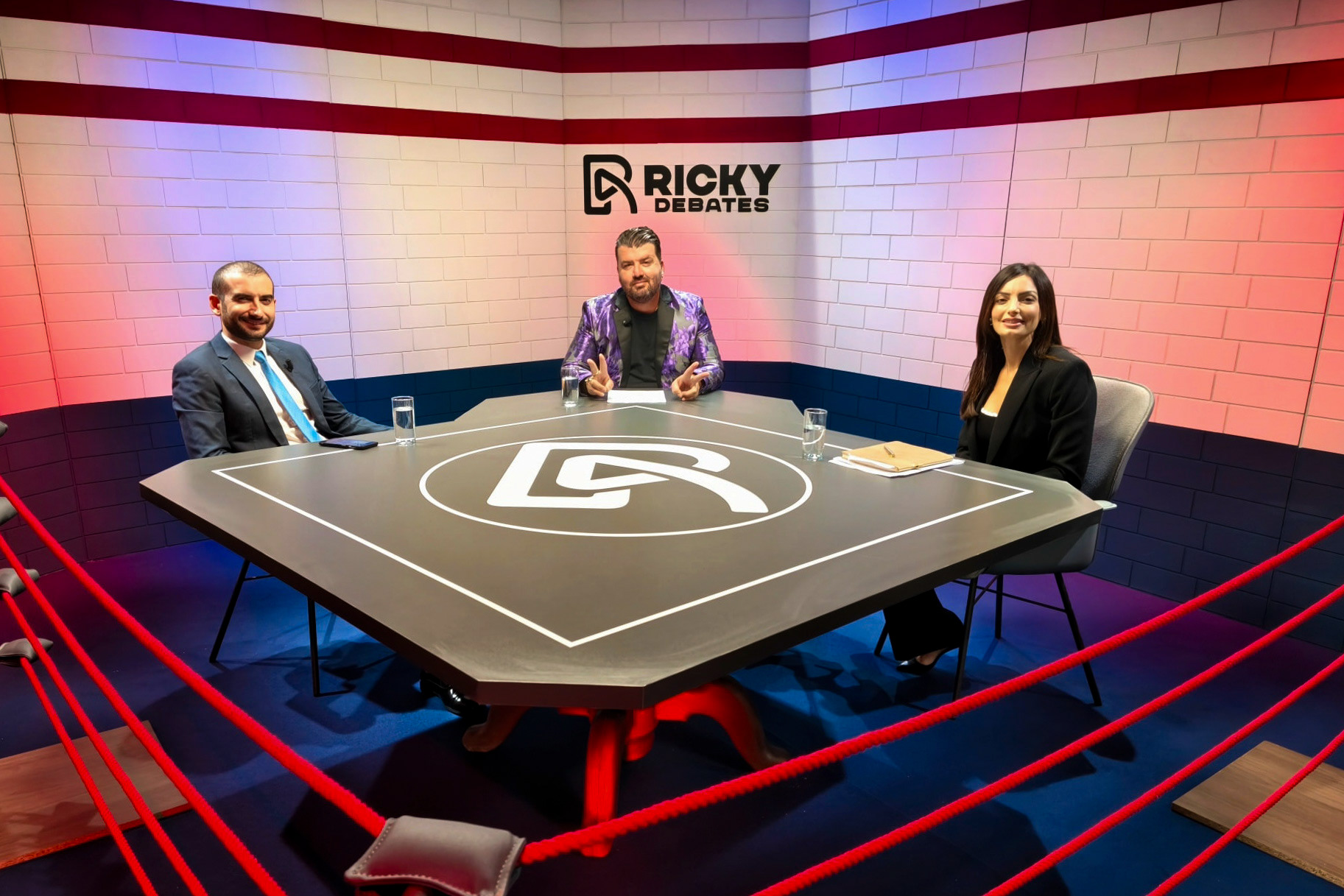
The mark is inherently flexible. It can live in different spaces, serving perfectly as an app or profile picture icon, a clear watermark, or a dynamic animated opener before the show airs.

PROBLEM DRIVEN DESIGN
This project demonstrates the value of instinct driven problem solving in design. By pivoting from a low-legibility concept to a bold, clean integration, the final logo delivers on all necessary requirements: meaning, flexibility, and maximum visual punch