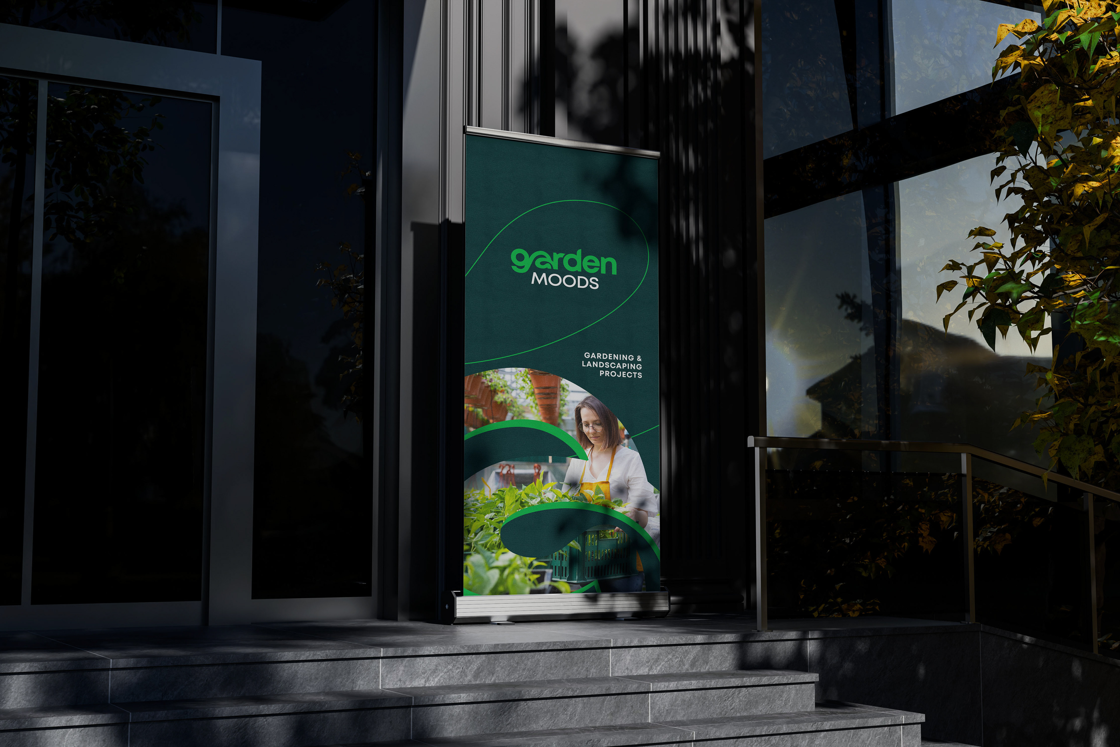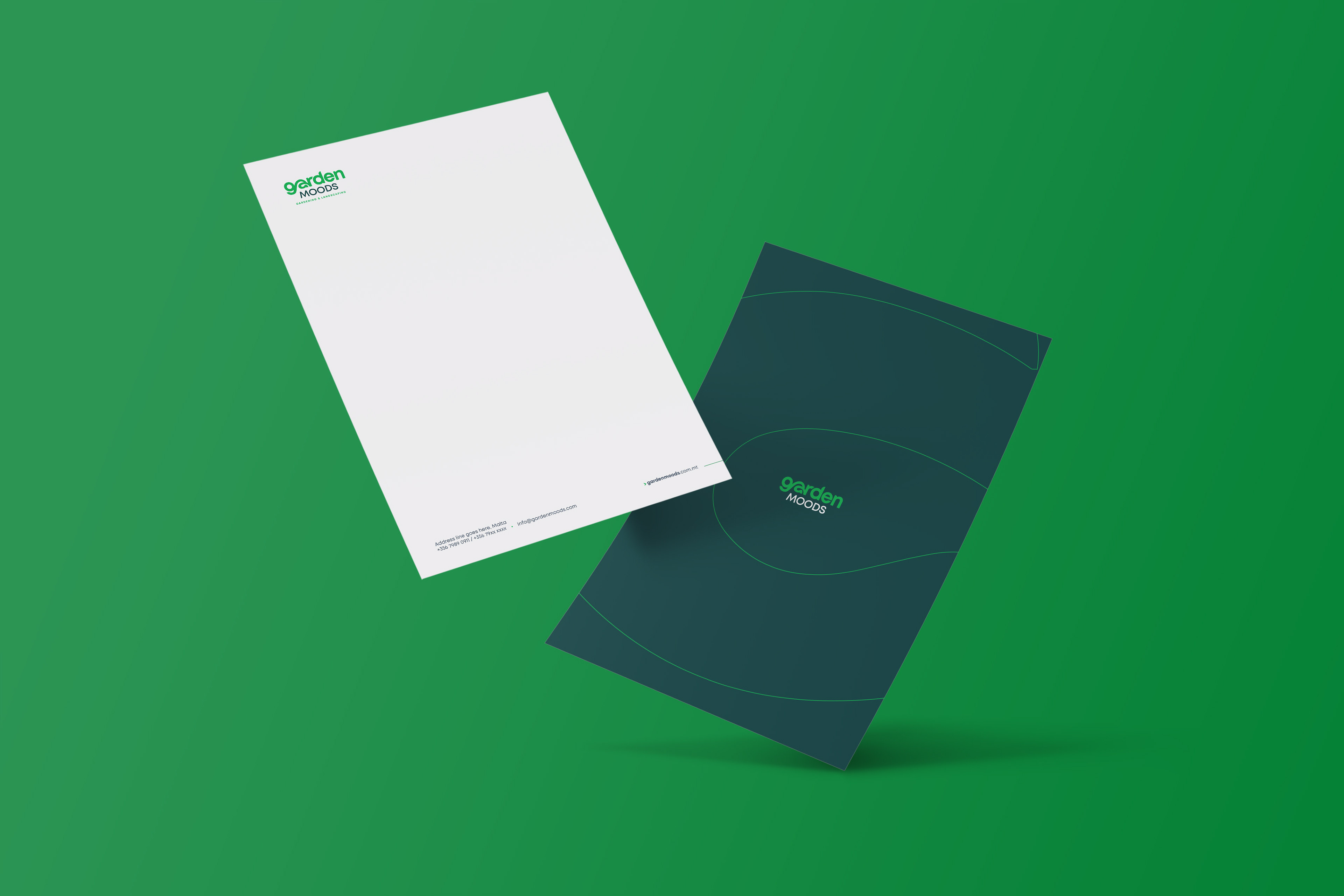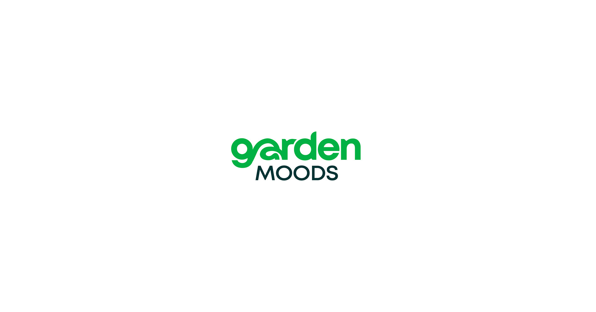
Visual Identity. Cultivating Calm and Balance.
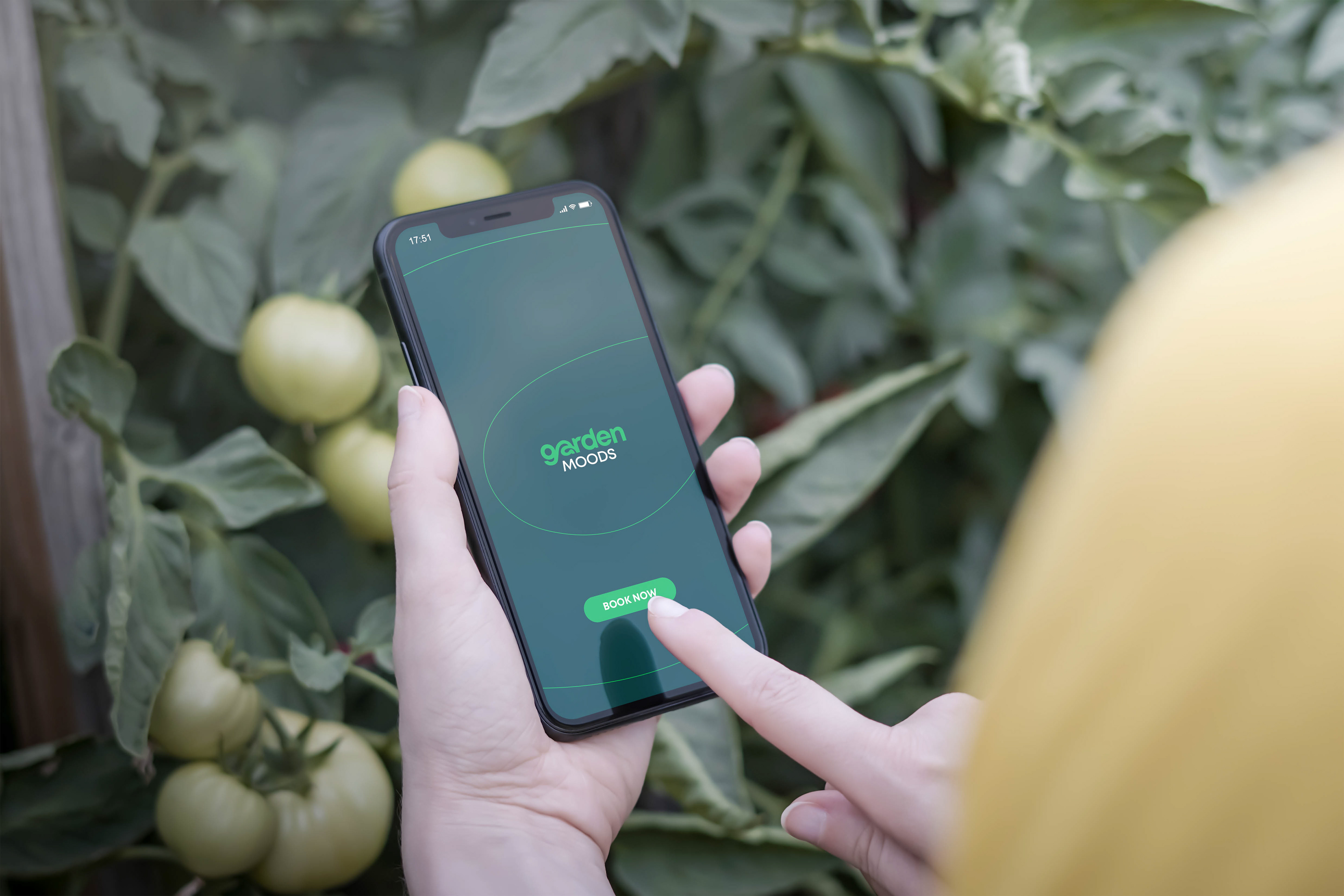
The objective for the Garden Moods brand was to create a visual identity that felt as fresh anf balanced. The logotype uses a sophisticated color palette and organic custom typography to convey the brand's core promise: transforming environments and enhancing emotional well-being.
The Identity: Organic Harmony
The design is a masterful exercise in simplicity, where color and flow are used to evoke the essence of nature and serenity.
The Flowing Logotype:
The main word, garden, uses smooth, rounded, custom typography. This soft, friendly style reflects the organic shapes found in nature and suggests an easy, flowing process - essential for an easy going brand experience.
Color Moods:
The strategic dual color palette is key. The deep, rich green immediately anchors the brand in nature and growth, while the supporting dark color adds a sense of stability, depth, and sophistication. The contrast beautifully represents the balance between wild nature and controlled design.
Visual Balance:
This logo mark creates an aesthetic balance that mirrors a well-composed landscape: lush growth supported by strong foundations.
This identity is a testament to how subtle creative choices - the perfect curve of a letter, the specific blend of two greens, can effectively communicate an entire service philosophy, promising harmony, professionalism, and creative transformation for any outdoor space.