Visual Identity. Creative Direction.
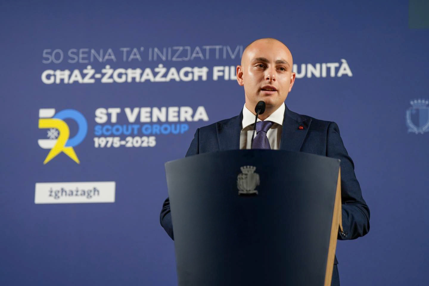
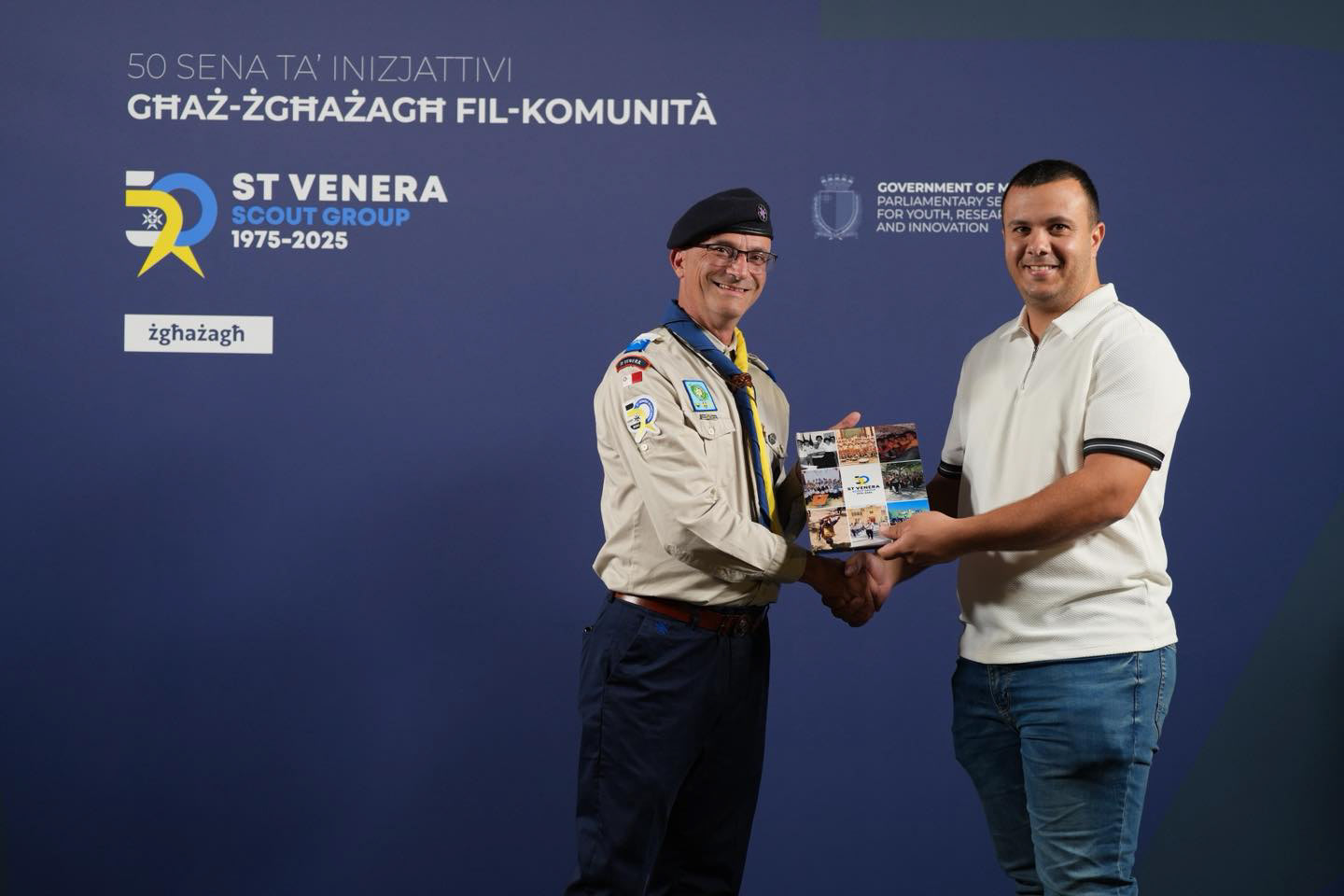
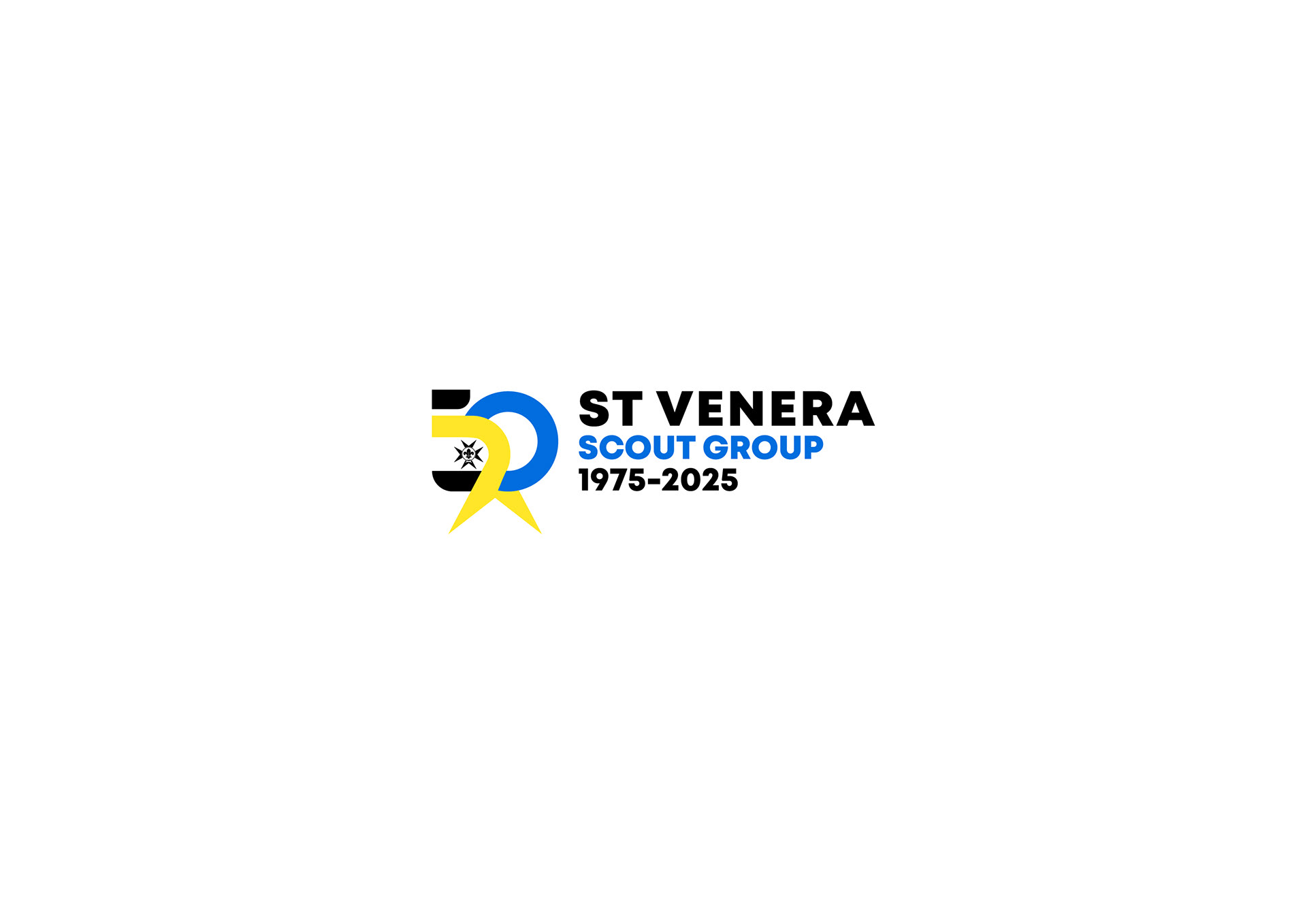
The challenge was to create an identity that not only celebrated the St Venera Scout Group’s 50th Anniversary (1975-2025) but also honored the group's roots and the core values of the Scouting movement. This design is a commemorative mark built on history, community, and forward motion.
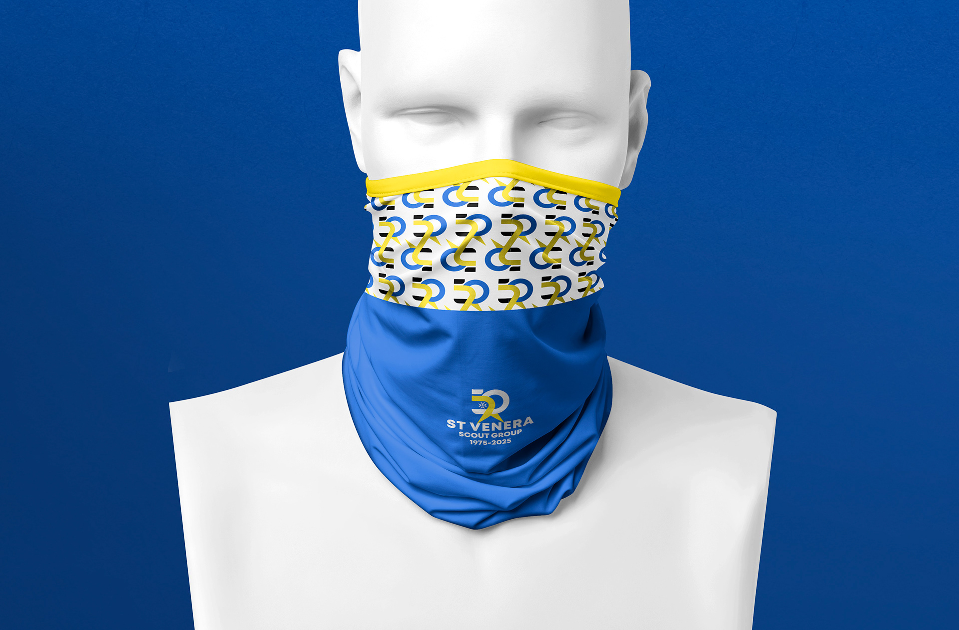
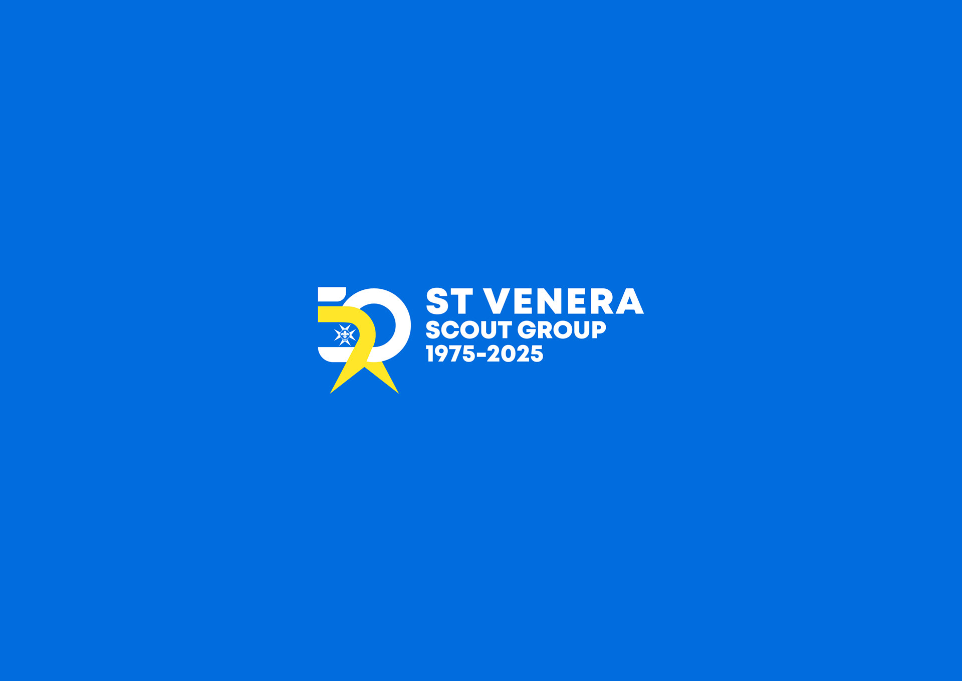
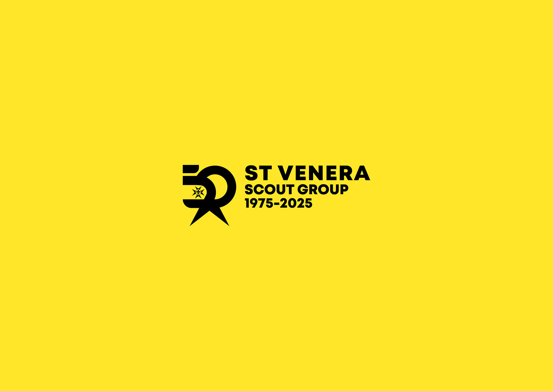
The Identity: A Commemorative Fusion
The logo mark is a dynamic fusion of heritage and celebration, designed to be highly recognizable on uniforms, flags, and event materials:
The Golden 50:
The design prominently features the number 50, boldly signaling the half-century milestone. The composition uses the Group's colors (blue and yellow) to construct the numerals, instantly tying the celebration to the established visual identity.
Celebrating Roots:
Client requested integrating subtly within the design the Scout Fleur-de-lis along with the Maltese Cross, grounding the anniversary mark in both the international Scouting movement and the local cultural context.
Dynamic and Forward:
The style is energetic and contemporary, avoiding a dated feel. The overlapping and contrasting colors create a dynamic visual movement, representing the group’s continued growth and future adventures.

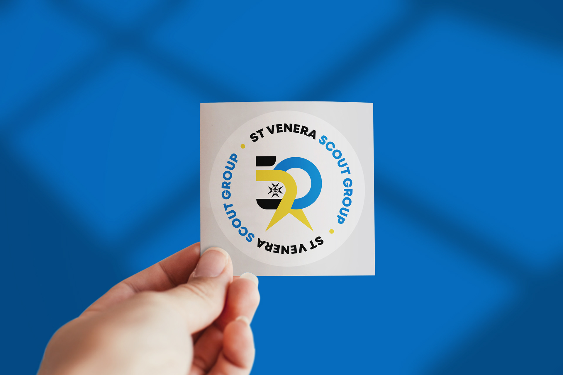
50 Years of Adventure
This project is a successful exercise in creative commemoration, demonstrating the ability to craft a design that is both a respectful nod to the past and an energetic symbol of the group’s future. It’s a mark that encourages celebration and community pride.