Visual Identity. Creative Direction. Photography.
The objective for CORE Functional Fitness was simple: create an identity as strong, enduring, and effective as the training itself. The resulting logo, designed back in 2020, stands as a testament to timeless, intentional design. A mark that continues to perform without feeling dated.

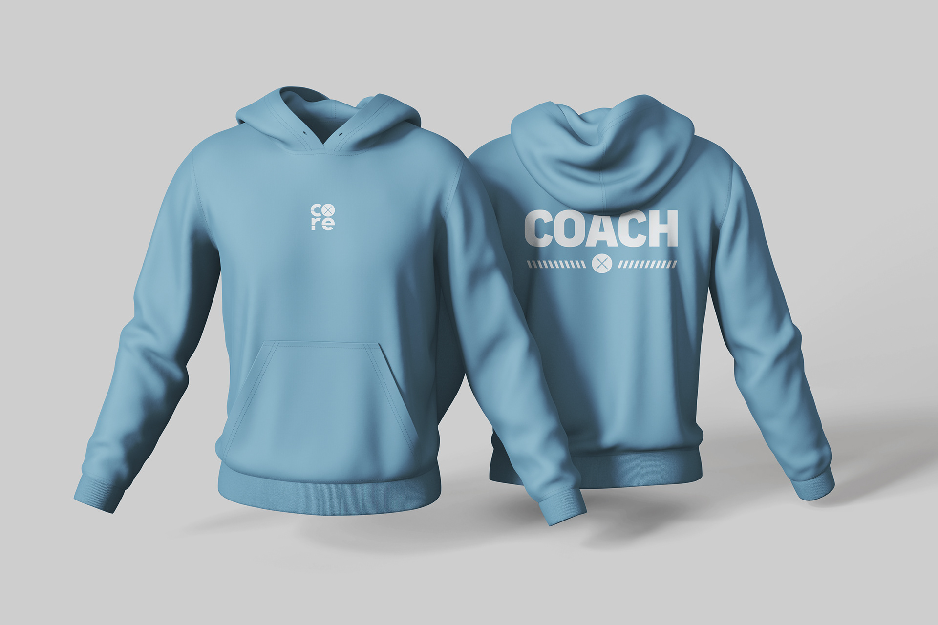
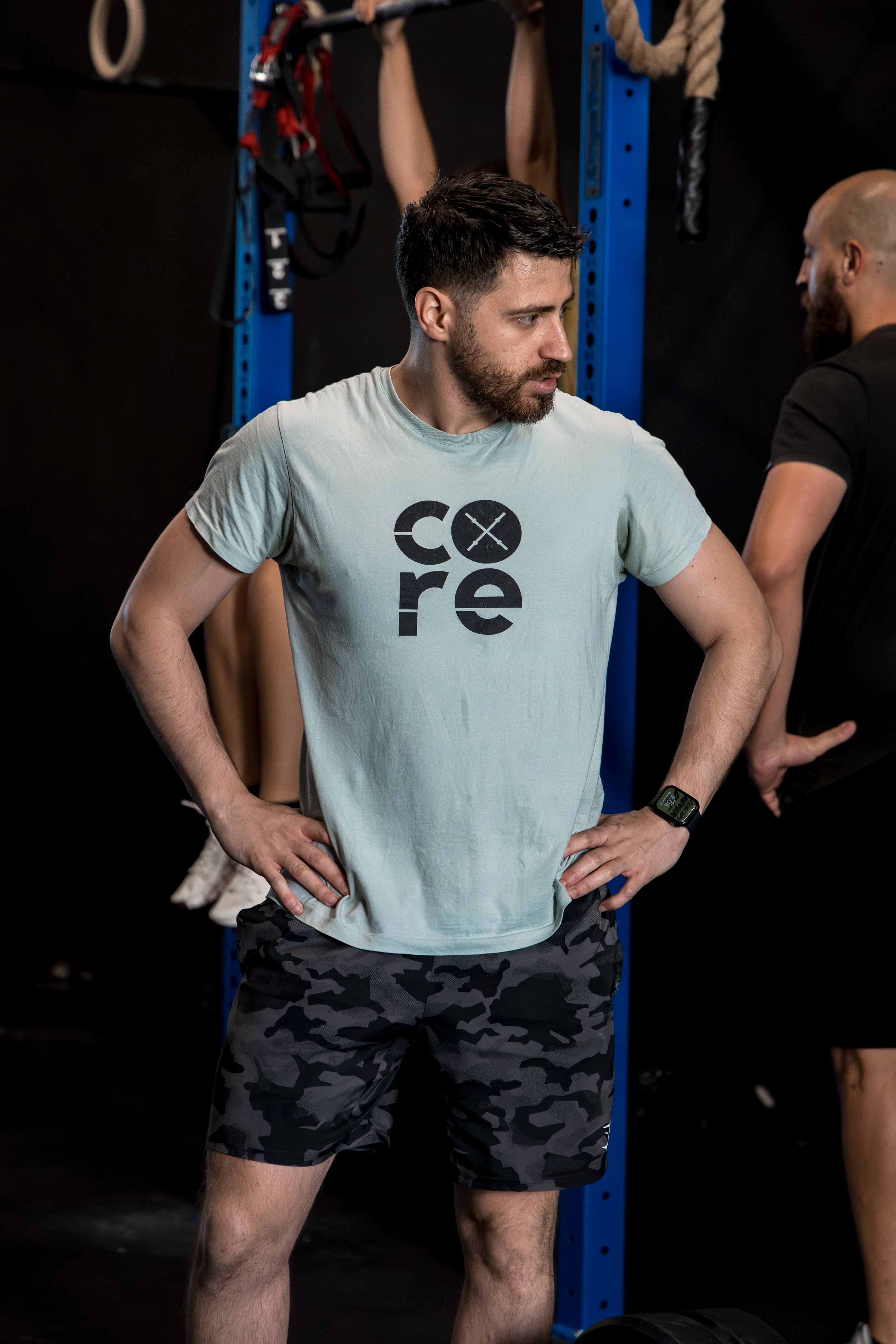
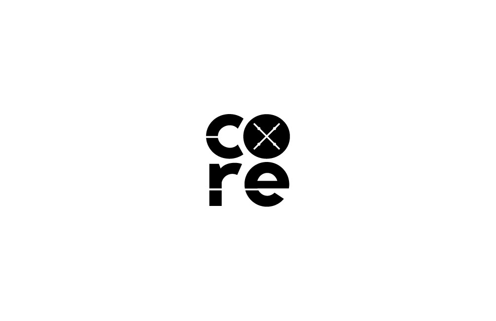
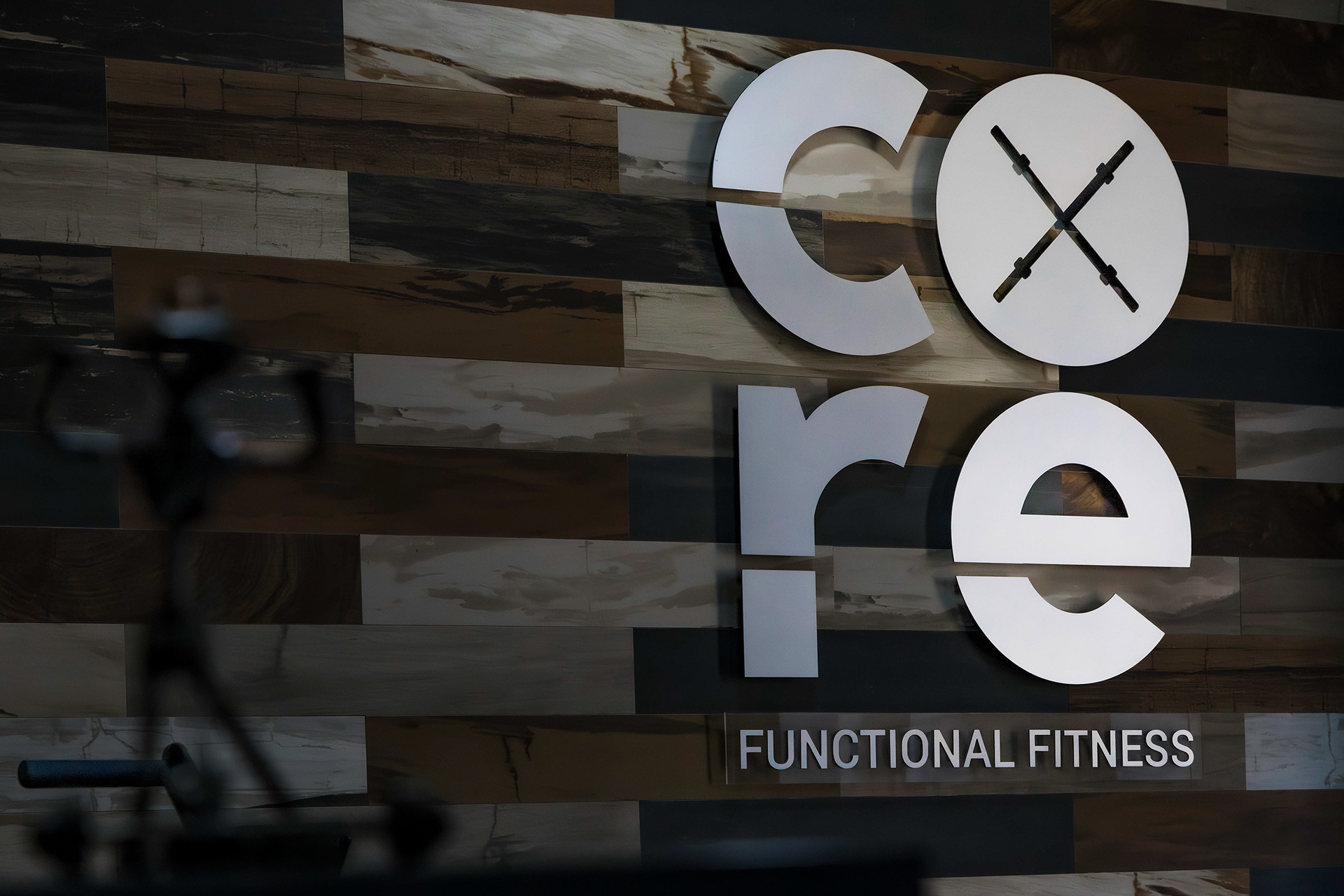
The Identity: Sleek Strength
The CORE logo is an exercise in powerful simplicity. Every element was crafted to be clean, bold, and representative of the gym’s core values:
The Logotype:
The sleek, modern custom type is designed to convey stability and high performance.
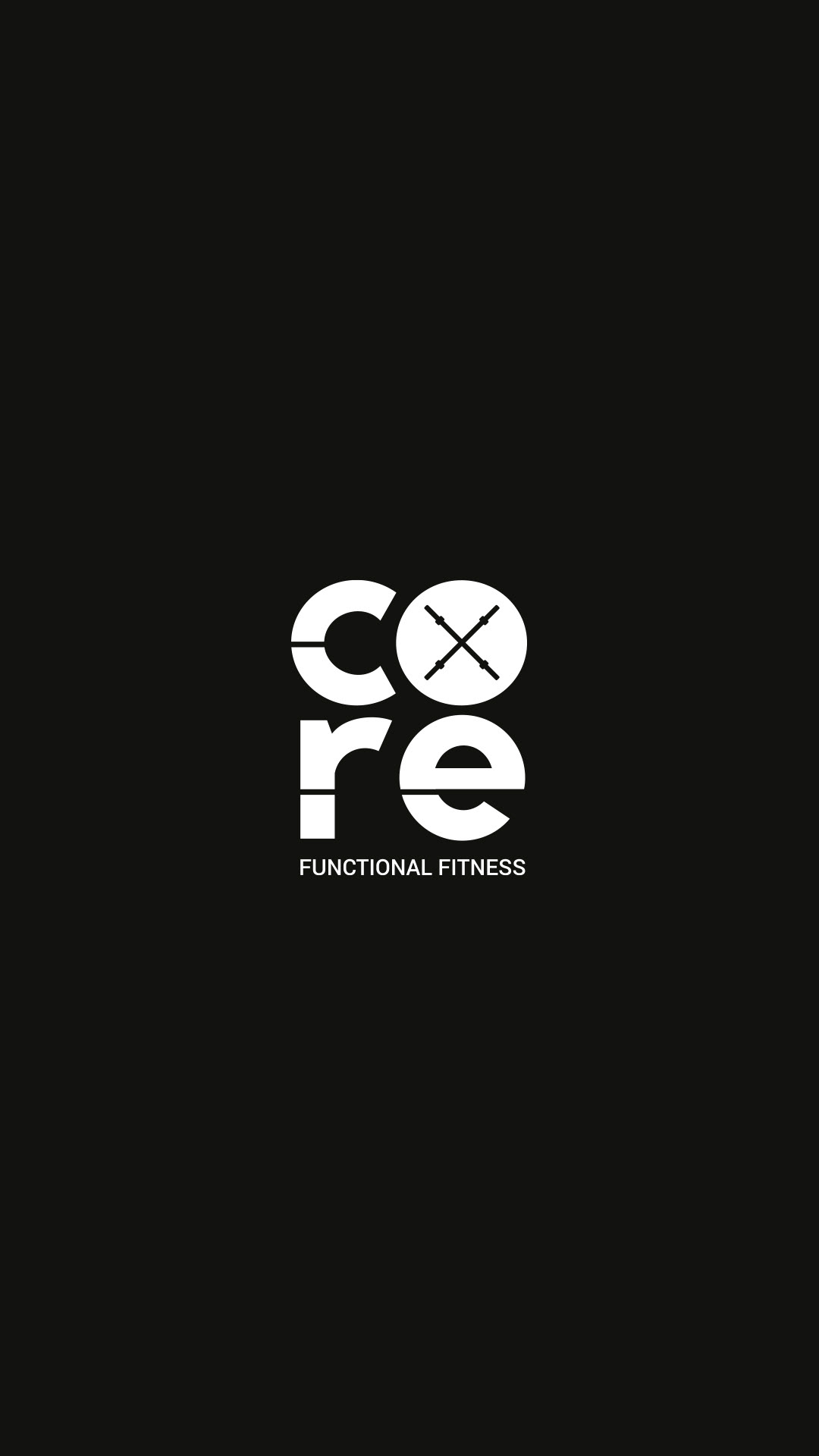
The Mark:
The circular 'O' acts as the brand’s dynamic icon, featuring two crossed, stylized kettlebells or bars. This symbol immediately speaks to functional training and focused movement without overcomplicating the visual narrative.
The Aesthetic:
Set against a backdrop of raw, textured wood, the silver, dimensional execution grounds the brand in an aesthetic that is premium, robust, and highly functional.
Core Philosophy
This project is a perfect example of design that’s built to endure, proving that focusing on strong fundamentals yields a creative outcome that is truly timeless.