Seasonal Festival/EVENT Branding
The Valletta Waterfront is a premier destination, and the objective was to create a cohesive yet adaptable visual system for its calendar of distinct seasonal events. This required translating the core elegance of the location into several unique moods, ensuring each festival had a fresh, unmistakable visual identity while maintaining brand recognition.
Mood & Adaptation
This project showcases the ability to execute end-to-end creative direction across diverse aesthetics and atmospheres:
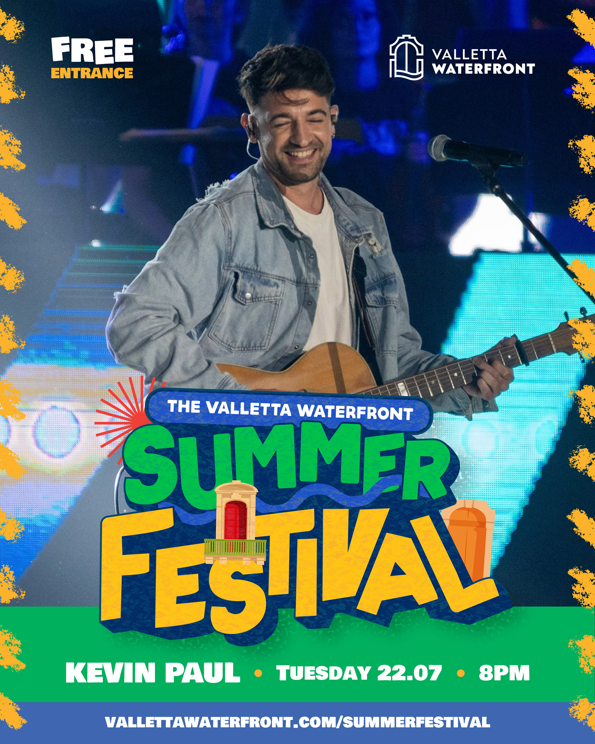
Summer Festival (The Energy)
The design is bold, vibrant, and energetic, utilizing chunky, dynamic typography and a rich, saturated color palette to convey the excitement and heat of summer celebrations. It's built for maximum visibility and fun.
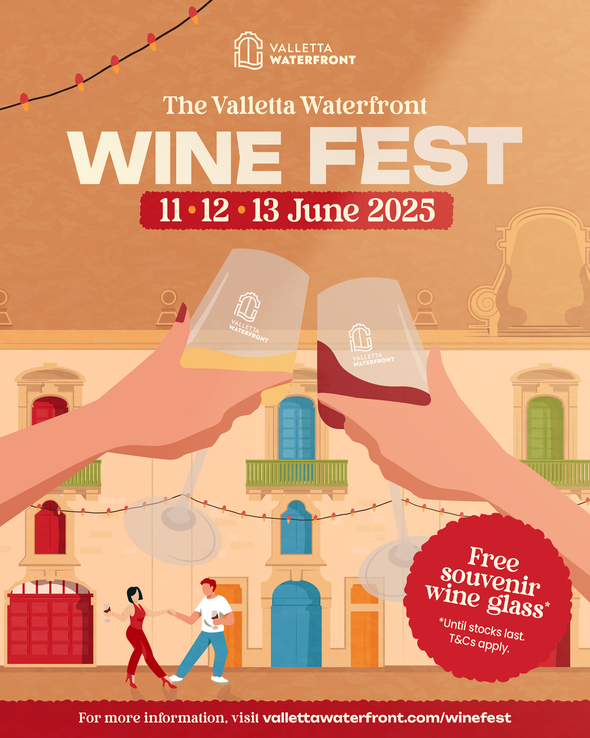
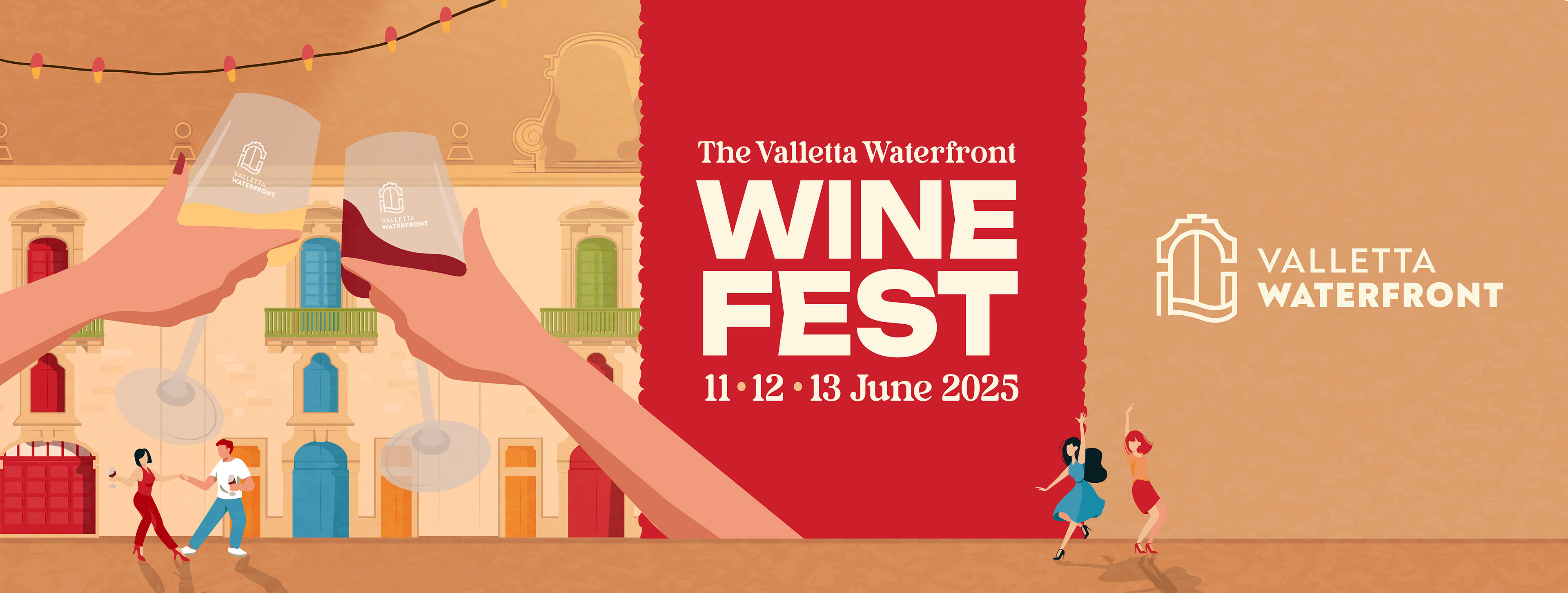
Wine Fest (The Sophistication):
The visual identity shifts to an illustration-heavy, elegant, and warm tone. The design uses rich reds and earth tones, focusing on scenes of celebration and the distinct architecture of the Waterfront to evoke a sophisticated, social atmosphere.
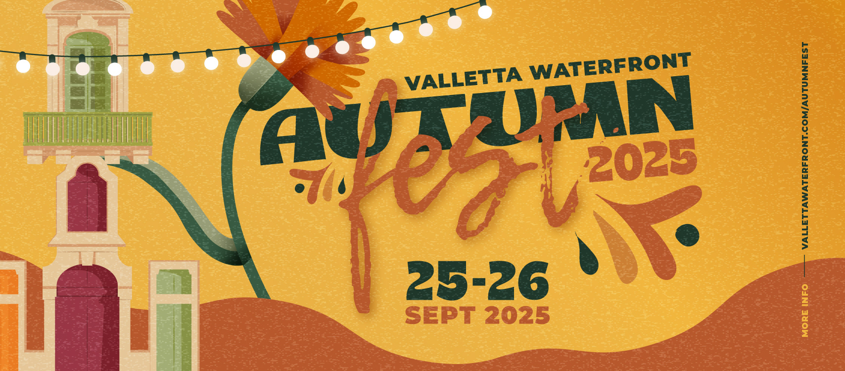
Autumn Fest (The Texture)
The design moves to a rustic, textured aesthetic, using harvest tones (orange, deep green) and stylized nature elements (flowers, leaves) to capture the cozy, community feel of the season's markets and artisan crafts.
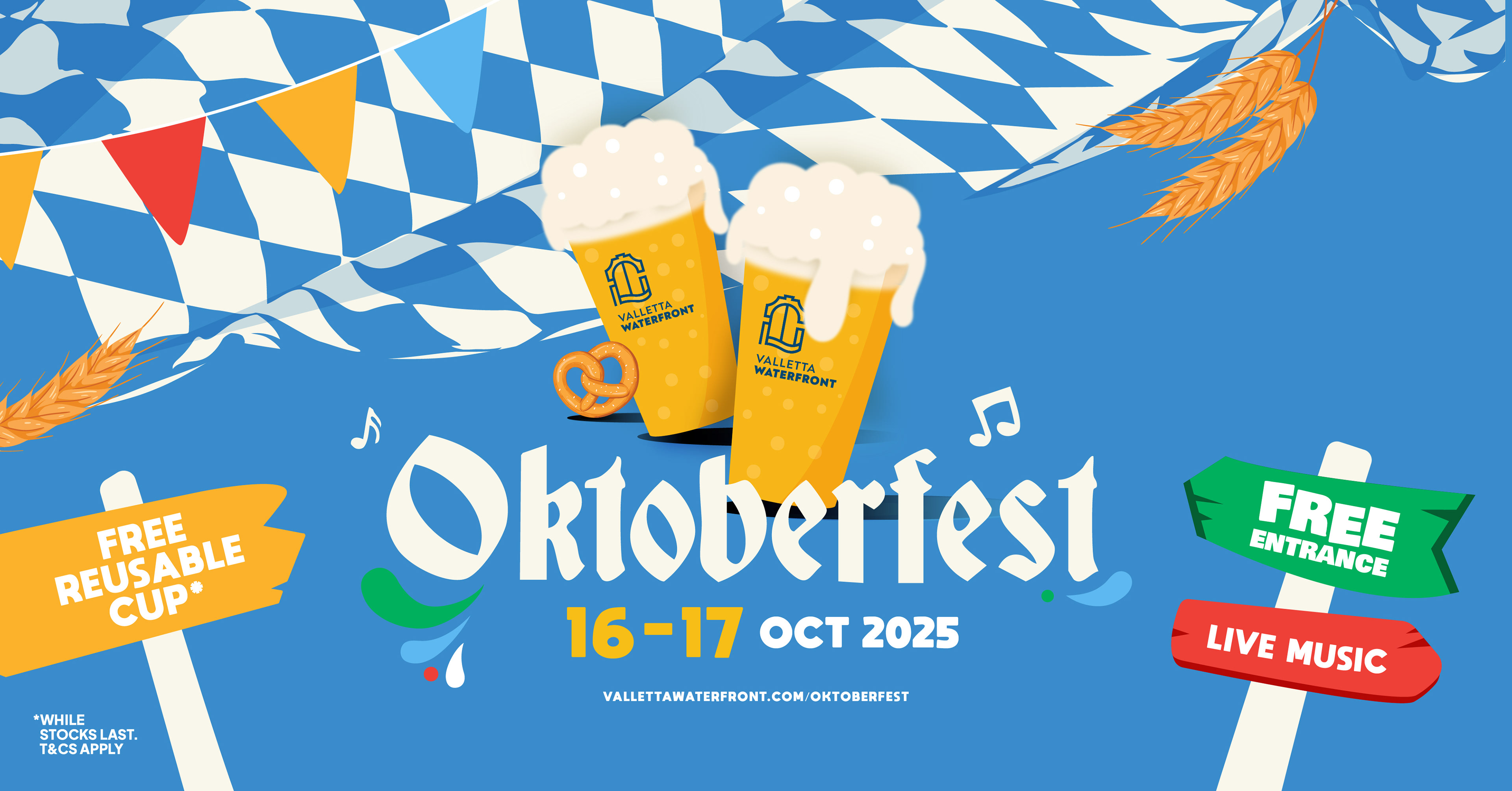
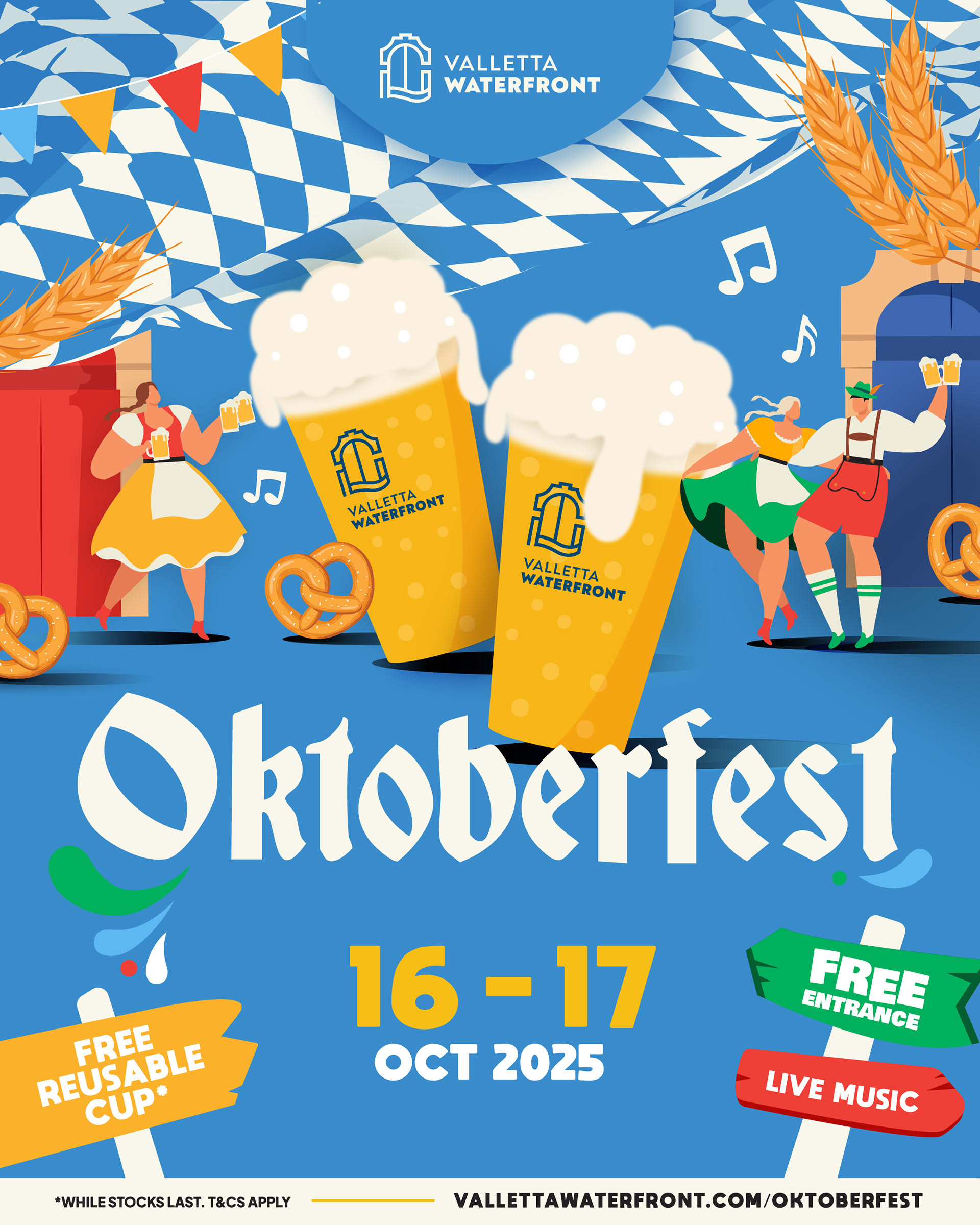
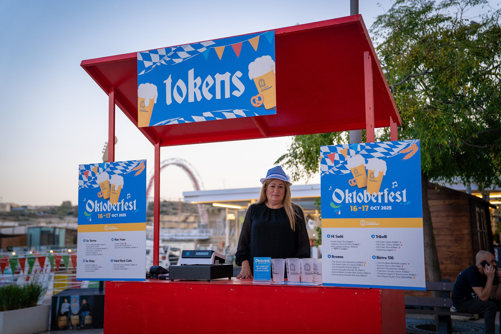
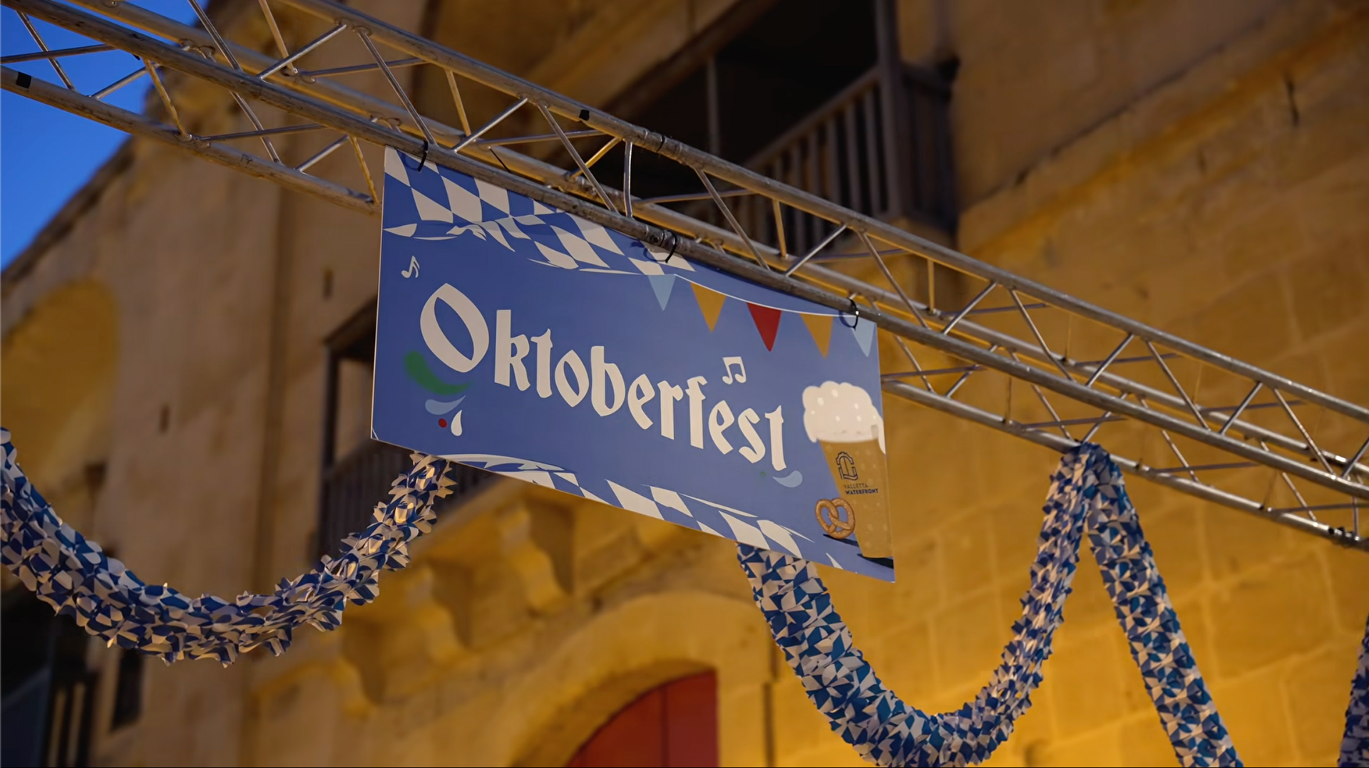
Oktoberfest (The Theme)
This identity fully commits to the international theme, utilizing the specific blue-and-white Bavarian flag pattern and playful, custom typography, ensuring instant recognition while clearly communicating the event's fun, beer-centric offerings.
Creative Impact
Across all events, the key deliverables were clear communication and strong atmosphere setting. Each poster and social graphic successfully communicated the key information (dates, free entry, activities) while simultaneously defining the mood for attendees, proving the agility to manage a complex portfolio of events under a single parent brand.
Photos All Rights Reserved. © Valletta Waterfront 2025.